

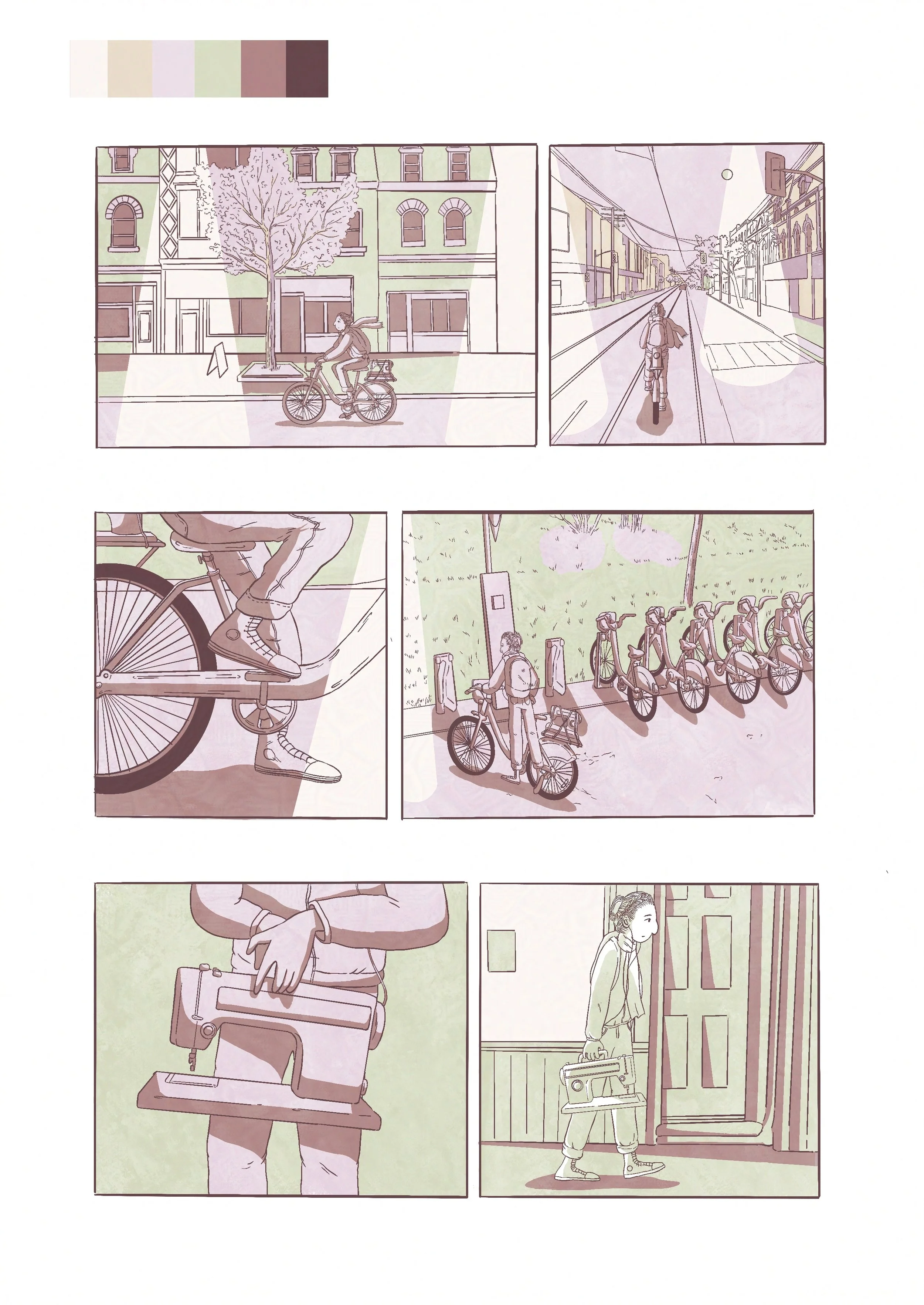
In the last little while, I have been trying to add colour to my graphic novel pages. I have always been attracted to beautiful, full colour graphic novels. So far, I haven’t been able to figure out how to add colour in my own work. My completed pages have mostly been in black and white. I have been researching colour combinations and testing them out onto some sample pages. I can’t say they have all worked, but some are starting to look like something. The challenge is to find a combination that is balanced, and that also reflects the mood and identity you are after for your book. Adjectives that come to mind for the colour scheme I am after are:
Elegant, soft, light, feminine, whimsical, subtle, ethereal, translucent, delicate, precious.

Something that I have also been thinking about lately is the blending of aesthetics from fashion magazines and the graphic novel. I’ve always had a fascination with the beauty and glossiness of fashion magazines, and I’d be curious to find a way to make the pages of my graphic novel have the same look.


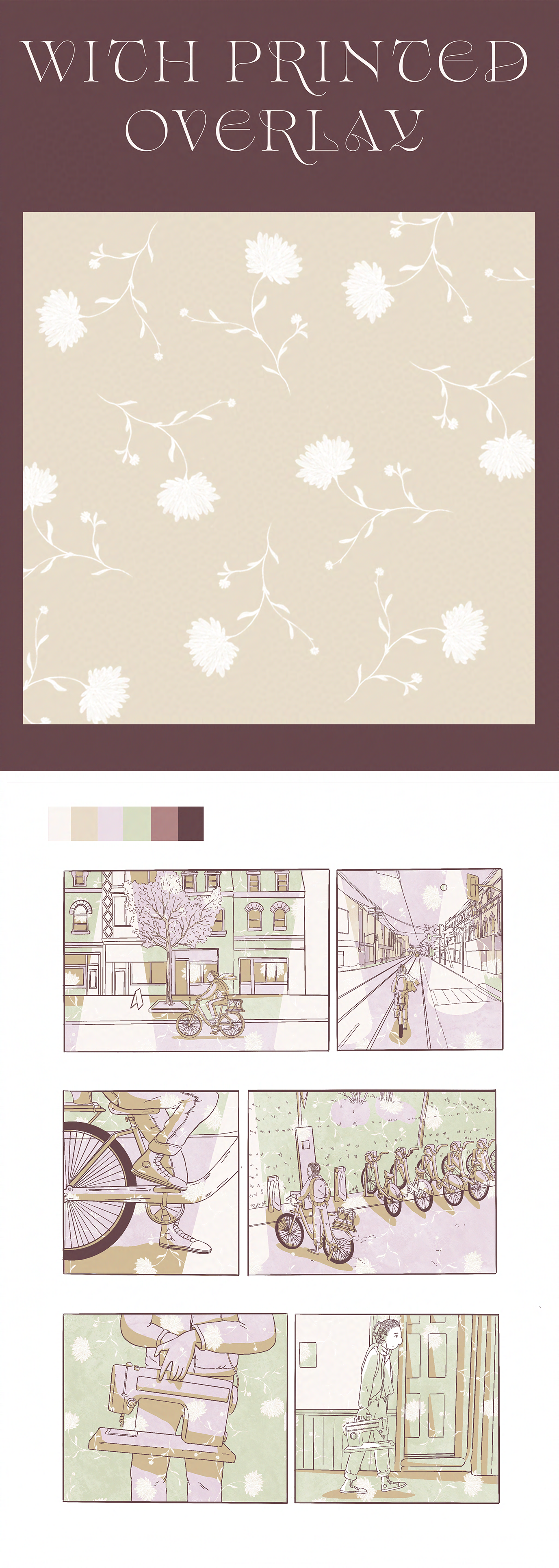
Another avenue I wanted to explore was the idea of integrating a wallpaper print into the graphic novel page. The idea is to have a floral foil, that suggests botanical elements, while also melting into the flat colour fills. I feel that this could be an interesting way to add texture and depth to the pages. I tested this on the same page shown above.
Meanwhile at home:
